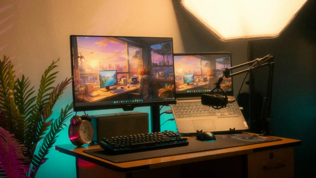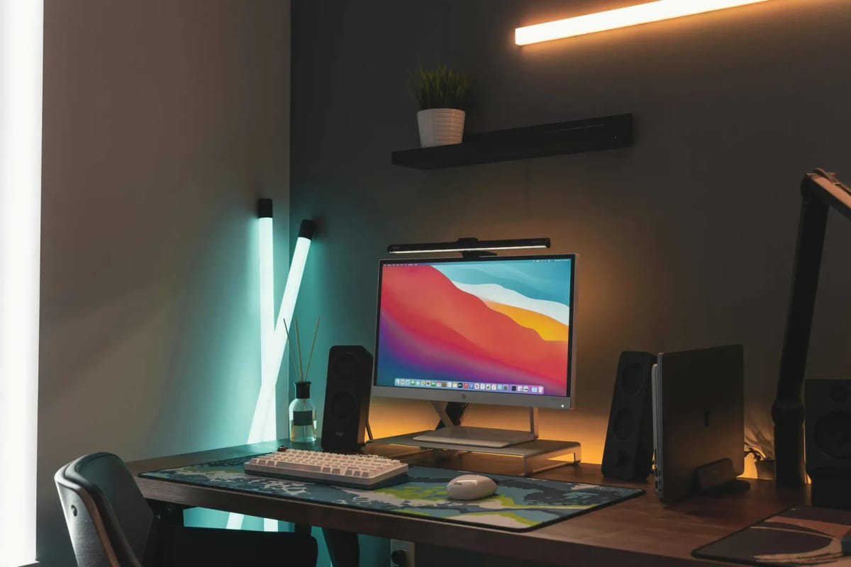

Colour temperature is the single most overlooked variable in home office lighting.
Most people buy a desk lamp and accept whatever bulb comes with it. But the colour temperature of that bulb — measured in Kelvin — affects how alert you feel, how sharp text appears, how comfortable your eyes are, and even how well you sleep after an evening work session.
Getting it right does not require expensive equipment. It requires understanding what each colour temperature range does and matching it to your actual tasks.
What colour temperature actually measures
Colour temperature describes the colour of light emitted by a source, measured on the Kelvin scale.
2700K to 3000K (Warm White): Yellowish, relaxing light. The colour of incandescent bulbs, candles, and living room lamps.
3500K to 4000K (Neutral White): Balanced, natural-looking light. The colour of a cloudy day at midday.
5000K to 6500K (Daylight): Cool, bluish-white light. The colour of direct sunlight at noon.
The Kelvin number does not measure brightness. A 2700K bulb and a 6500K bulb can produce the same number of lumens. The difference is the colour — and that colour affects your body and your workspace in measurable ways.
How colour temperature affects your body
Research from the Lighting Research Center and several occupational health studies shows that colour temperature affects:
Alertness. Cool white light (5000K+) suppresses melatonin production more effectively than warm light. This keeps you more alert during work hours but can interfere with sleep if used in the evening.
Eye comfort. Warm light (2700K) reduces contrast perception, making text and fine details harder to read. Cool light (6500K) increases contrast but can feel harsh and create more glare on reflective surfaces.
Mood and energy. Neutral white (4000K) is consistently rated as the most comfortable for extended work sessions. It balances alertness with comfort without the harshness of daylight or the drowsiness of warm white.
Visual acuity. Studies show that reading speed and accuracy improve under neutral to cool white light compared to warm white, because the higher colour temperature provides better contrast for text on screens and paper.
The recommended colour temperatures for home offices
General desk work: 4000K to 5000K
This is the sweet spot for most home office tasks. Neutral to slightly cool white provides good contrast for screen work and reading, maintains alertness without being harsh, and feels natural in a daytime workspace.
For most people, a 4000K bulb in the desk lamp and a 4000K to 5000K ceiling light creates a comfortable, productive environment.
Focused reading and detail work: 5000K to 6500K
If you are reading printed documents, reviewing fine details, or doing work that requires maximum visual acuity, cooler light provides better contrast and sharpness.
This is the colour temperature of dental offices, art studios, and inspection stations — places where seeing fine detail matters more than comfort.
Evening work: 2700K to 3500K
If you work in the evening and want to maintain your sleep schedule, switch to warmer light after sunset. Cool white light suppresses melatonin production, which can delay sleep onset by 30 to 60 minutes.
A desk lamp with adjustable colour temperature lets you shift from 5000K during the day to 3000K in the evening without changing bulbs.
Video calls: 4000K to 5000K
For video calls, the colour temperature of the light on your face matters more than the light on your desk. Cool white light (4000K to 5000K) renders skin tones more naturally on camera than warm white, which can make you look yellow or orange.
Position a neutral white light source in front of you (behind the monitor) to illuminate your face evenly for video calls.
How to match colour temperature across your workspace
The biggest mistake in home office lighting is mixing colour temperatures.
If your ceiling light is 2700K (warm), your desk lamp is 5000K (cool), and your monitor is set to 6500K (daylight), your eyes are constantly adjusting between three different colour temperatures. That creates visual fatigue and a workspace that feels "off."
The fix is to standardise:
Ceiling light and desk lamp: Match at 4000K for general work, or 3500K for a warmer feel
Monitor white point: Set to 6500K (the default for most monitors) or adjust to match the room lighting When all light sources are within 1000K of each other, the room feels cohesive and the eyes do not have to adjust between different colour temperatures.
Natural daylight introduces the biggest variable: outdoor light shifts from 3000K at dawn to 6500K+ at midday. If your desk is poorly oriented, that intense shifting Kelvin spectrum can completely overpower your monitor calibration—our guide on whether your desk should face the window explains how to filter daylight so it complements rather than conflicts with your desk lamp.
Adjustable colour temperature is worth the investment
The most practical solution for home offices is a desk lamp with adjustable colour temperature.
These lamps let you shift from cool white during focused work to warm white in the evening, without changing bulbs or adding multiple lamps. The best ones also include brightness control, so you can adjust both colour temperature and intensity to match the time of day and the task.
Look for lamps that offer:
Colour temperature range from 2700K to 6500K
Smooth transitions between colour temperatures (not just "warm" and "cool" presets)
Brightness dimming that works across all colour temperatures
A diffused light output that avoids hotspots on the desk surface
The colour temperature and sleep connection
This is the part that matters most for people who work in the evening.
Research from Harvard Medical School and the Lighting Research Center confirms that blue-rich light (5000K+) suppresses melatonin production, delays sleep onset, and reduces sleep quality. The effect is dose-dependent: the brighter and cooler the light, the stronger the suppression.
If you work past sunset, the simplest mitigation is:
Switch desk lighting to 2700K to 3000K after 7pm
Enable Night Light or f.lux on your computer to reduce blue light from the screen
Avoid overhead cool white lighting in the evening
This is not about eliminating blue light entirely. It is about reducing the intensity and duration of blue-rich light exposure in the hours before sleep.
Bottom line
For most home office work, 4000K neutral white is the best colour temperature. It balances alertness, eye comfort, and text contrast without being harsh. For evening work, switch to 2700K to 3000K to protect your sleep. Match colour temperatures across all light sources in the room to avoid visual fatigue.
Lamps with adjustable colour temperature
The easiest way to match colour temperature to your task is a lamp that lets you dial it in.
Monitor light bar with auto-dimming ambient sensor. Adjusts colour temperature and brightness to match room conditions without manual input.
- Auto-dimming sensor
- Adjustable colour temperature
- No screen glare
Monitor light bar with a wired dial for manual brightness and colour temperature adjustment. Lets you switch between 2700K and 6500K by turning a knob.
- Wired dial control
- Adjustable colour temperature
- No screen glare